Securing a Neighborly Presence
Some Context
After a number of years gathering without a permanent location, Redeemer Detroit made the transition into a long-term venue, settling on Grand River Avenue at one of Detroit's most historic catholic cathedrals.
Redeemer Detroit offers a rare blend of historical liturgy with relevant preaching and songs that set the worship experience apart in the downtown region of Detroit.
Constraints
I joined the team in the midst of a pandemic and transition into the new space, which required me to understand quickly, implement appropriately, and iterate incessantly.
My Role
As the lead designer on the project, I oversaw a diverse range of responsibilities that were integral to every aspect of the project. My duties included researching, designing the brand, creating documentation, UX design for the website and mobile app, creating the sanctus typeface revival, and designing collateral.
The Problem
The transition into a new space introduced user experience hurdles for the congregation, including altered navigation paths, unfamiliarity with the new space and parking, adjustments in service schedules, as well as the ability to share accurate directions. The transition and continuing growth of the congregation also created cracks in the church’s online community platform and user journey, carrying visitors from their first visit on towards membership and commitment.
The Goals
1) Develop Redeemer’s identity system and tone of voice to effectively communicate with congregants and new neighbors of Core City
2) Provide a clear and accessible experience for visitors to both the physical address and online touchpoints (website, mobile app, and social media)
3) Eliminate hurdles in the user journey from discover through the champion phase
2) Provide a clear and accessible experience for visitors to both the physical address and online touchpoints (website, mobile app, and social media)
3) Eliminate hurdles in the user journey from discover through the champion phase
St. Leo's (left) on cold winter morning from Grand River Ave., 1928. Detroit congregants after Sunday mass (right). © Virtual Motor City
St. Leo‘s Detroit during construction, 1911
© Virtual Motor City
© Virtual Motor City
Kickoff
To kickoff the project, we put a strong emphasis on qualitative research techniques, including a kickoff meeting, exploring user behaviors and needs, analyzing competitors, consulting stakeholders, and a critical stage: creating personas. We also developed some key questions:
1) How will we be located and identified as we transition into this new space?
2) What are the various ways in which our church community platform supports or falls short in meeting the diverse needs of our congregation?
3) What challenges could we face moving forward?
4) How will we measure success?
2) What are the various ways in which our church community platform supports or falls short in meeting the diverse needs of our congregation?
3) What challenges could we face moving forward?
4) How will we measure success?
Understanding the User
To gain deep insights into the congregation's needs and pain points during the transition phase, I spearheaded an extensive qualitative research initiative, centering on interviews. Recognizing the pivotal role these conversations play in understanding user behavior, I engaged with a diverse cross-section of Redeemer Detroit's congregation, both long-standing members and recent attendees. Through these interviews, I gathered qualitative data that was used to create personas, user stories, and user journey maps, which formed the cornerstone of our design decisions.
High-level User Journey from discovery to champion phase (personas as different locations along the journey)
Challenge #1 | Clarity & Consistency
With a new location along a heavily-trafficked road, Redeemer’s identity system was required to work a lot harder than it had in the past. I developed the existing identity into a system, ensuring clear execution for consistent brand representation and alignment across diverse mediums through the duration of the project.
Rebrand began with an updated logo, adjusted for increased visibility and consistency
Arch, pulled from existing logo to integrate into developing identity system
Arch symbol representing church building (left) and weekly gatherings, rain or shine. Media application of arch symbol as frame to embrace and preserve content (right).
Style guide for alignment across diverse mediums
Revival of typeface found in apse of sanctuary, recontextualized for use in Redeemer display settings
Challenge #2 | Visibility
In order to ensure accessibility, that members and visitors could properly locate, identify, navigate the building, and share accurate directions, we listed our location online, developed clear directions, parking, and interior wayfinding for the new, permanent location.
Redeemer welcome banner
Wayfinding and ‘Redeemer Kids’ wall installation
Photograph above St. Leo's and Core City Neighborhood, 2022
Location listings providing accessibility to visitors across the web
Narrative social media content to increase visibility (+700% increase in reach)
Engaging historic social media content (increased social shares by +500%)
Challenge #3 | Eliminating Barriers
A strong majority Redeemer’s website traffic comes from those within the ‘discover’ and ‘evaluation’ phases of the user journey. To serve their needs, the flows and IA were designed around our personas David and Aria, looking to gather information and make their first contact with Redeemer online.
User flow for David, a grad student looking for information on Redeemer for the first time
Low-Fidelity prototypes
Redeemer Detroit website, designed to help users through discover and evaluation phases (increased web engagement time +38%)
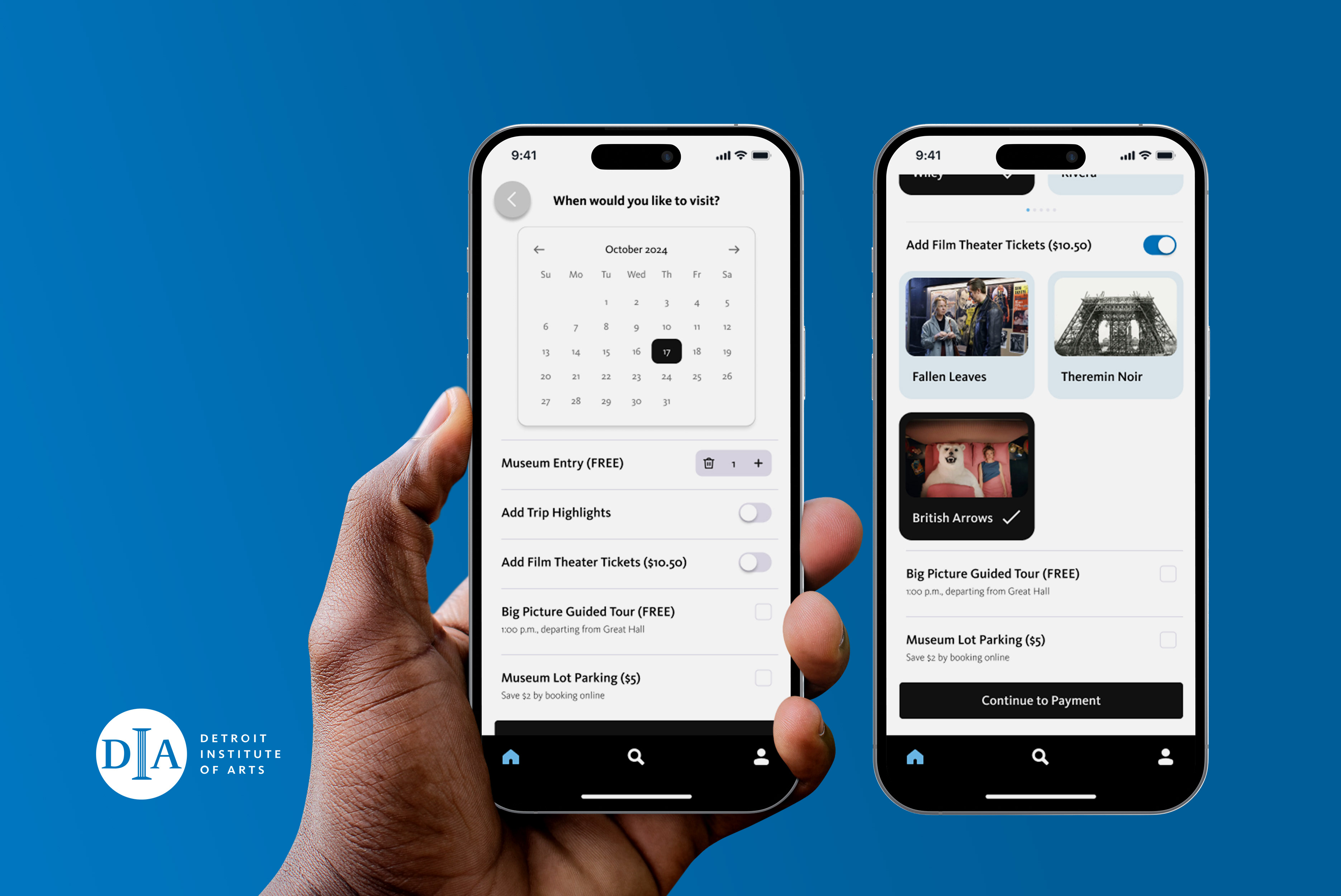
New Redeemer Detroit app to drive small group and volunteering engagement
Takeaways
This project has provided the necessary research and foundation to continue to refine and develop member and visitor user experiences, as Redeemer further settles into the Core City neighborhood. We are using the Google HEART framework to measure the success of the community app.
1) Happiness: Did members indicate they were more satisfied with their experience as measured via survey, before and after launch?
2) Engagement: How long did members stay within the app? Did they open the app more than once during the week?
3) Adoption: Which features did members use most? Which were ignored?
4) Retention: Did members continue to engage with community via app instead of using GroupMe or group texts?
5) Task Success: Were members able to check their serving schedules, communicate about changes, and interact with their small group through the app?
Let’s build something great together. Get In Touch
